from my sketchbook
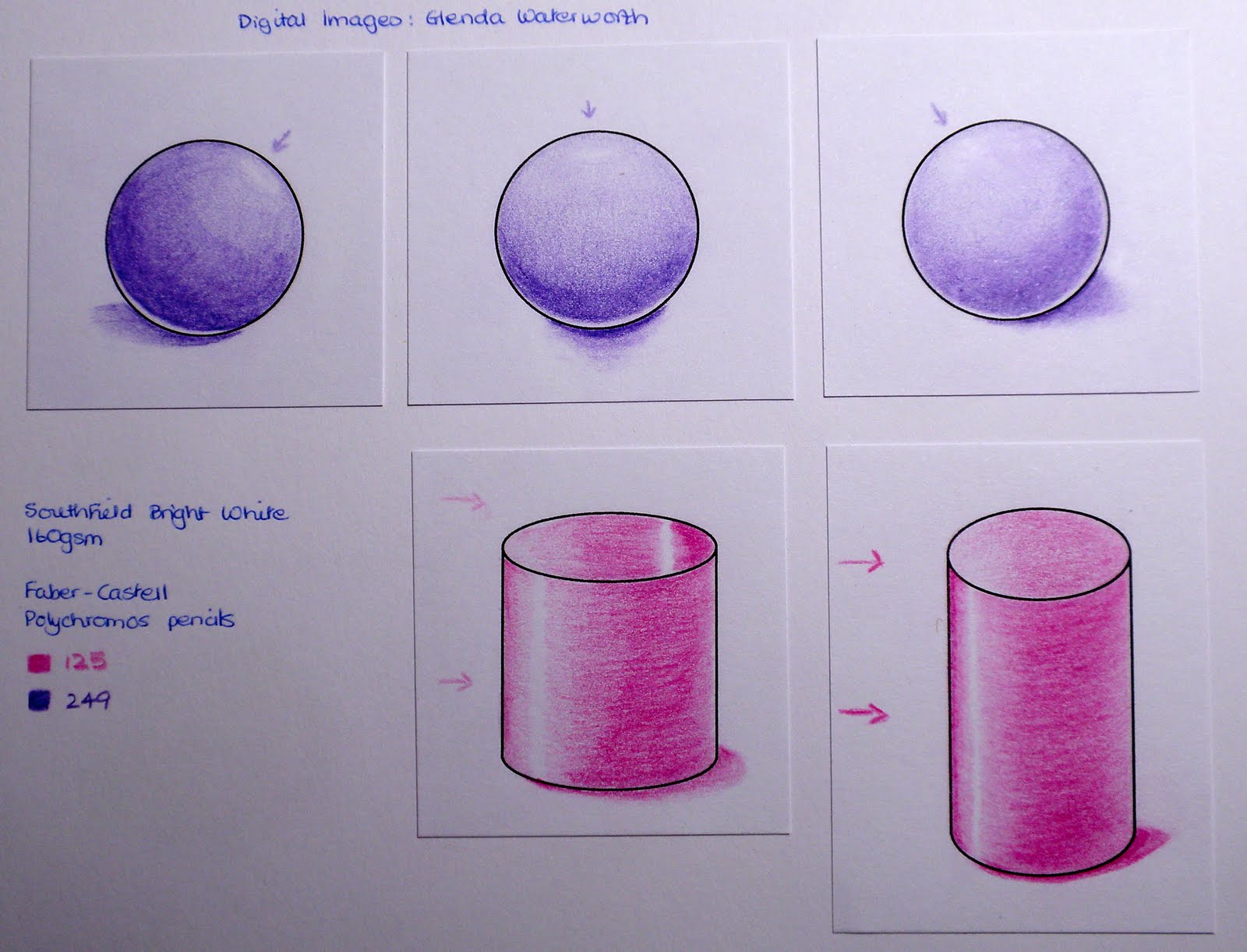
Prior to my first Colouring 101 classes this May I cannot remember ever having tried exercises such as shading spheres & cylinders, doughnuts & spirals. When attempting to colour a snail last summer I struggled to understand quite how to make the shell look real. Since then I have shied away from using that stamp - though snails are amongst my favourite images. After hours of colouring in May I made a start on the spheres & cylinders looking real but the doughnut & spiral defeated me as I could not grasp the shading relationships. I'm hugely encouraged this time round for I see progress since then & have tangible evidence of practice being the key to improvement.
hollow (left) & solid (right) cylinders
doughnut & spiral (ammonite)
Rather than copying Glenda's examples exactly I wanted to try applying the same principles of colour theory & shading/shape by using different colours &/or images. Although this entails a certain amount of bin filling it is extremely thrilling to make discoveries & the only way I can lose is not to dare to try.
I'm unsure about the highlight but it was magical being able to
achieve the gradations of colour simply by layering pencil colours
My first encounters with pencils last year gave rise to many questions & through the class I've discovered that others also struggle when it comes to choosing brands & papers. I thought it worth adapting some of Glenda's homework exercises in order to explore my own resources & to keep a record of my thoughts & conclusions. At the end of the day it will be a matter of personal preference & access to materials that will determine choice.
Cardstock for Polychromos
Using the same colours of Polychromos pencils I stamped & coloured the fish onto 3 different cardstocks: Southfield 200 MIC Bright White 160gsm; W H Smith White Card 220gsm; Winsor & Newton Lana Cartridge Paper 130gsm.
There is very little discernible difference in appearance but the real variations became apparent when applying colour to the surfaces. I was initially trying to improve upon the Southfield (smooth & bright white) with regard to the ease of laying down & blending layers of colour but found the other two surfaces even more difficult to use. I thought that the W H Smith would be an improvement as, although it is greyer in colour, it has more tooth. I found this surface too springy with the pencil almost making indentations in the surface unless I was extremely light-handed. Creamy in appearance & with a little tooth the Cartridge Paper seemed somewhat resistant to the application of colour & it was hard work laying down a smooth blend
Left: 25 layers of colour, Right: 7 layers of colour using Sansodor to blend along right edge

Discarding the Cartridge Paper I decided to try the heavier Craftwork Cards Digital Ultra Smooth Premium 250gsm Cardstock really giving each strip of card a hammering with 25 layers of Polychromos colour & then brushing my finger over the coloured surface. The Southfield was fine, just starting to catch a little as the layers were piled on. The W H Smith caught more & was a bit patchy as the layers increased, finally it smudged under my finger. The surface of the Craftwork Cards cardstock although smooth began to disintegrate before I had finished applying the 25 layers.
The more usual application of 7 layers was tolerated by all 3 cardstocks with the Craftwork Cards being the smoothest but blending patchily with Sansodor & allowing migration of colour along the edge. The Southfield wasn't as smooth when layering but gave by far the smoothest blend with Sansodor & did not allow any migration at the edge. The W H Smith was also somewhat patchy in blending both by layering & with Sansodor, plus it allowed colour migration along the edge.
Wax-Based or Oil-Based
When Glenda demonstrated how to use a Blender Pencil during the first course I wondered if it mattered that I was using the oil-based Lyra Splender with the wax-based Derwent Coloursoft pencils. Since I had some Lyra Pencils I tested it out & found that it didn't. I have just discovered a technical book (The Ultimate Guide to Colored Pencil by Gary Greene) which confirms my findings.

Having discovered that the wax content of the Coloursoft pencils accounts for the debris & smudging when colouring I decided to compare my tin of 36 wax-based Derwent Coloursoft Pencils with my tin of 36 oil-based Faber-Castell Polychromos Pencils (I came across these tins in a Sale when I first started crafting & impulsively bought them!!!!). I find the selection of 36 colours doesn't intimidate me but provides an adequate variety with which to work. For the above blending of colours I selected similar colours from each set & used the Derwent wax-based Blender for the Coloursoft & the Lyra oil-based Splender for the Polychromos.
Derwent Coloursoft
- English wax-based available in 72 colours
- give off debris when colouring & thus require frequent sharpening for finely detailed work
- debris allows smudging & less defined edges
- other wax-based brands - US Prismacolor Premier, Swiss Caran d'Ache Luminance 6901
Faber-Castell Polychromos
- German oil-based available in 120 colours
- very little debris (if any) retaining a sharp point for finely detailed work
- allows clearly defined edges with minimal smudging
- other oil-based brands - German Lyra Rembrandt Polycolor, Swiss Caran d'Ache Pablo
Recipe
Images Fish - Elusive Images (now Chocolate Baroque) UDLSP0330 Something Fishy; Circles & Cylinders - digitally provided by & copyright Glenda Waterworth.
Ink Memories Black.
Colouring Unless otherwise specified - Faber-Castell Polychromos Pencils.
Cardstock Unless otherwise specified - Southfield 200 MIC Bright White Card 160gsm.
I would very much value any comments/suggestions regarding other brands of pencils & cardstock/paper.