PEP tangles - my Zentangle Inspired Art blog

Monday 30 April 2012

MCC Card Design Workshop Wk 2 - Serendipity Squares & Apprenticeship

Links: Glenda Waterworth, My Creative Classroom (MCC)

When I'm working through the optional exercises I often find I am surprised by my own reactions. The making of Serendipity Squares & a Grid Layout was a case in point. On the face of it sticking scraps of paper down & stamping over them doesn't seem terribly onerous or exciting, but it was certainly a challenge for me. I think RANDOM was a word that bypassed my vocabulary for there I sat having retrieved all the offcuts of paper from the various packets that they "belonged" to & had to resist the urge to sort them into piles of colours. It was actually quite relaxing just taking the pieces any old how & creatively utilising those scraps proved extremely satisfying. I did apply a little choice in my final grid arrangement - placing a lilac cornered square into each of the grid's corners.

front view 
angled view showing sparkle & dimension
Choosing a design to analyse & make my own version of brought to mind how an artist used to learn his craft by serving an apprenticeship & copying his Master's work. Knowing that certain elements are required for a design to be successful is all well & good but it is through recognising, applying & physically creating those elements that real understanding comes.

I recently came across Debbie Martin's card (see immediately below) using Pan Pastels & remembered being struck by the way the chequered arrangement of her colours was echoed by not only the actual harlequin stamp pattern but its diagonal placement.

Debbie's original
 sketches showing how the eye moves
 in response to the design elements
The asymmetrical variation of the layered flower & the corner swirl, in what is basically a symmetrical layout with a central focal point, causes the eyes to pause so as to read the sentiment & not merely to skim over it. Moreover, the layered flower also acts to draw the eye to focus on itself & then leads down along the swirl to the harlequin daisy arrangement, onto the left of the corner swirl, moves right & up along the opposing swirl into the other harlequin daisy pattern &, exiting via the top double daisy arrangement, drops to the sentiment panel.

As I don't have any Pan Pastels I had to experiment a little to find a medium which would allow the removal of some of it in order to achieve Debbie's subtle whitening of the flower petals. Distress Inks on watercolour paper were too vibrant but I have several brands of barely used chalks which I purchased during my initial crafting enthusiasm. I tried using those stamping with VersaMark, dabbing with the chalk applicator, erasing (Derwent battery eraser) & fixing with cheap hairspray. This led to my discovering that there are chalks & CHALKS; the cheaper ones were gritty & didn't cover as well as the more expensive creamy Pebbles Inc. which I ended up using as I loved the results. I also improvised with my sentiment & die-cuts as I had neither of those that Debbie used. Additionally I varied my version by changing the flower & layering it differently plus I swapped the colours about.
I'd like to thank Debbie for allowing me to use her artwork for my exercise.

front view
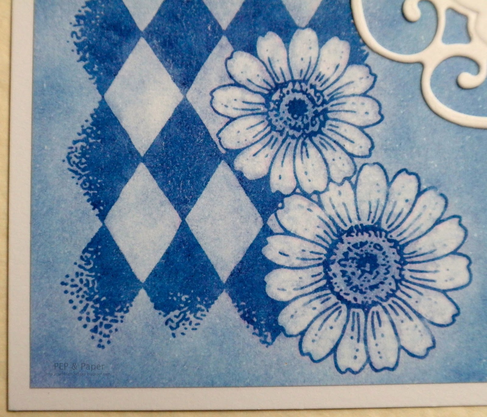
close-up showing detail of petals from which colour
was lifted
close-up of layered flower showing dimension &
colour lifting on petals


Recipe
Stamps Chocolate Baroque UA4SP0146 Big Flowers (layered flower), UA4SP0237 Butterfly Daisy Collage (daisy harlequin & corner swirl) & UA5GW0360 Words of Comfort & Cheer (sentiment).
Colouring Pebbles Inc. Chalks (Basic Brights).
Inks VersaMark watermark stamp pad, Memories Dye Black (sentiment).
Die Marianne Designs Creatables LR0116 Frames & Swirls.
The white cardstock & green pearl were from stash.

Monday 23 April 2012

MCC Card Design Workshop Wk 1 - Mood Board

Links: Glenda Waterworth, My Creative Classroom (MCC)

I struggle with card or tag design & even when I'm provided with a sketch I find it very difficult to choose colours & assemble something that looks pleasing - it easily takes me a week of trial & error (bin filling) to produce one item. I often have to just start with an idea & see what happens. Hence, having learnt so much from Glenda's previous MCC classes, this workshop seemed an ideal opportunity to learn a more structured & informed approach to my creating.

The optional homework for the first week has included the compiling of a Mood Board - not something that I have ever attempted before but quite enlightening. I don't naturally gravitate to using patterned paper so I decided to take an offcut left over from my "J" Alphatag (to be posted in due course) as my starting point. Dating from my initial inkpad purchases (2008) I have some ColorBox Pigment & Chalk "Cat's Eyes" that I tend to forget about so I selected colours to match the paper from amongst those to stamp some egg images which were labelled with tag swatches. Selecting & placing the remaining items - ribbon, gems & punched shapes became very interesting because I was surprised by my own reaction when I placed some of the pink butterflies onto the green cardstock - there was too much contrast so I moved them to the pink/brown/cream area.

 Mood Board (A4 in size)
upper section of Mood Board
lower section of Mood Board

Recipe
Stamp Chocolate Baroque UA5SP0386 Easter Traditions.
Inks An assortment of ColorBox Pigment & Chalk "Cat's Eyes."
Cardstock An assortment of colours in various textures & finishes from stash.
Paper Graphicus Guild Membership Pack
Punches CarlaCraft (leaves), EK Success (large flowers), Woodware (butterflies & medium flowers), Xcut (tags & small flowers).
The ribbon, gems & sequin are from stash.

Thursday 12 April 2012

Immortal Imagery & Iconography Alphatag

I cannot remember when my delight in peacocks began but I recently decided to research their symbolical meaning when used in artwork &/or architectural ornamentation. I was astonished to discover that the early Christians adopted the peacock as a symbol of immortality because by shedding its feathers annually & replacing them with brighter ones the bird represents the resurrection of Christ. There was also an ancient legend that peacock flesh does not decay after death. Having imagery & iconography in my head not to mention immortality plus the current Christian festival of Easter  it seemed logical to work with these ideas for my Baroque Guild "I" Alphatag. I inadvertently used the Imperial purple but it is rather apt.

front of tag
close-up of upper section showing stamped text, small
heat embossed cross & sequin embellishment 
close-up of central section showing gold peacock
overstamping of patterned paper 
close-up of lower section showing heat embossed
large cross & "I" plus die-cut corner embellishment
back of tag showing tone
on tone stamping
close-up showing paper pierced scallops
& inked edges of theme panel

Recipe
Stamps Chocolate Baroque UA5SP0386 Easter Traditions (crosses & text), UA4SP0183 Peacock Fan (peacock) & UA4SP0171 Peacock Glory (feather); Elusive Images UDLHC0181 Sketchy Alphabet (letter "I").
Inks Memento Grape Jelly (text, tone on tone stamping & inking various cardstock edges); Encore Gold (peacock); Emboss Tinted Embossing Stamp Pad with Stampendous Detail Gold Embossing Powder (crosses & letter "I").
Pens etc...  Staedtler Triplus Fineliner.
Cardstock Gold & an assortment of purples in various finishes from stash.
Paper Graphicus Guild Membership Pack.
Dies Sizzix Movers & Shapers L Die - Tag & Bookplates, Cuttlebug Vintage Corner.
Punch Woodware (scalloped rectangle).
The gem, brad, sequin leaves & ribbon are from stash.

Friday 6 April 2012

Honour & History in Heraldry Alphatag

My "H" Alphatag for the Baroque Guild swap incorporates the idea of honour in the form of a knight being both an honourable person & being honoured by a monument after death, for example in the form  of a stone, marble or brass effigy. Although I've not been able to identify the particular knight in my stamped image he is most likely a monumental effigy, probably brass, in some cathedral or church, though I have coloured him to represent stonework (rather fittingly sponging with Pumice Stone Distress Ink).

front of tag
close-up of upper section showing gold script
overstamping of patterned paper
close-up of central section
close-up of lower section showing heat
embossed shield
back of tag
close-up showing paper piercing of theme panel

close-up of knight
Recipe
Stamps Chocolate Baroque UDLGW0010 Medieval Heraldry.
Inks Memories Dye Black (knight & inking edge of tag); Black Soot (for inking various cardstock edges) & Pumice Stone (sponging knight) Distress Inks; Encore Gold (script & inking some cardstock edges); Emboss Tinted Embossing Stamp Pad with Stampendous Detail Gold Embossing Powder (shield).
Pens etc... Signo uni-ball gold gel pen.
Cardstock White & black from stash.
Paper Graphicus Guild Membership Pack.
Die Sizzix Movers & Shapers L Die - Tag & Bookplates.
Punches EK Success (fleur-de-lis), Woodware (scalloped oval).
Pearls Papermania.
The gold mesh & black ribbons are from stash.

Pergamano Embossing Pad, a
selection of ball tools & Perga Soft
Challenge Entered
Simon Says - use your FAVOURITE tool!
I have quite a few favourite tools but in the end I decided to pick the tools I use for shaping cardstock & neatening cut edges. Bev Rochester was the first person I came across using a ball tool for shaping flowers & neatening any roughly cut edges of cardstock. More recently I discovered Debby who rarely makes a card without shaping layers. Over time I have gathered a little bundle of tools (pictured) which are in constant use. Initially I used candle wax to "lubricate" the ball tool but being greasy it makes any edges a little difficult to ink.
close-up showing shaping of stamped image