Some of you know that I have chronic migraines so my head misbehaves quite often though with powerful medication I've got good control & the number of days with migraines down to single figures each month. During the last couple of weeks I've spent more time in bed than I like to as the migraines have been daily & sometimes not very responsive to medication. This is not anything to worry about as it does happen periodically & I have to restabilize through altering medication but I wanted to explain my lack of blogging & entering challenges. Disorientation through movement becomes a problem & sometimes it is just safer to plonk me in bed with the laptop or something that can be done with the minimum of movement.
I'm trying to keep up with the preparatory work for moving my blog & also working on making a ProMarker/Copics equivalent chart.
Monday, 27 June 2011
Sunday, 12 June 2011
MCC Colouring 101 Wk 5 - Alcohol Markers
As I mentioned in my previous post the final week of MCC Colouring 101 comprised an overview of alcohol markers, more specifically Copic Markers, their numbering system & blending techniques.
I found this suprisingly challenging & after the best part of almost two days trying to get a blend I considered sufficiently smooth (maybe I'm trying to do something I'm not supposed to?) I was contemplating this bin


I found this suprisingly challenging & after the best part of almost two days trying to get a blend I considered sufficiently smooth (maybe I'm trying to do something I'm not supposed to?) I was contemplating this bin
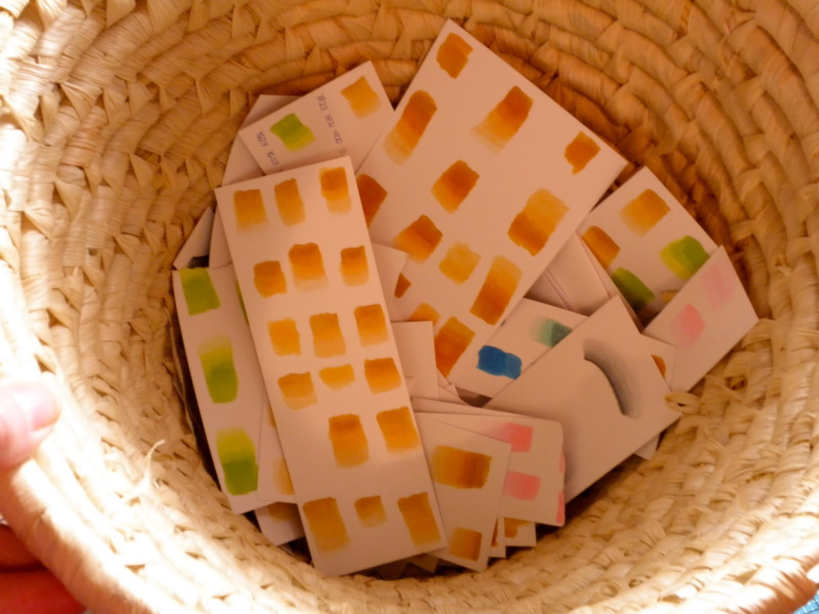
I decided to press on regardless & did some serious thinking whilst I continued the exercises during the course of which my Copic Ciao Blender ran out & I switched to using my ProMarker one.
a smooth (?) gradient & fading to white


creating a shadow
despite using cardstock specifically designed for use with alcohol markers you can see that I had bleeding

feathering using the colourless blender to create smoke
Digital Image: Glenda Waterworth

creating water on glossy cardstock & sky with Distress Ink

flames
Digital Image: Glenda Waterworth

glows
Stamp: Chocolate Baroque UA5SP0333 Christmas Angel of Light
Ink: Memento Tuxedo Black

So, I have come to the conclusion that Copics MAY not be for me. For the moment I am reserving judgement, but I am not buying any more because:
- I find the results unsubtle & very "in your face" with a lot of effort required to create something approaching a reasonable blend.
- The constant capping & uncapping is cumbersome & though I tried leaving them uncapped whilst blending this resulted in the ink becoming sticky & thwarting my efforts. My very small hands may account for this - but they will be small no matter how much I practise with technique.
- I personally am unable to control the brush tip adequately hence there is real difficulty in applying the ink within the boundaries of a stamped image.
On a positive note I now know that any problems using the Copics are:
- NOT due to the wrong cardstock - I've lost count of the number of recommended ones that I've tried.
- NOT due to a lack of understanding the Copics numbering system - Glenda's explanation was enlightening.
- NOT due to having an insufficient range of colours - with various offers etc..... over a period of time I have collected just over 170 or so.
It is now a silly time of the morning & I need some more sleep before I do my Sunday bookselling duty in the local secondhand bookshop. I have a MacBook training session to prepare for on Wednesday & I am suffering from Card Challenge Withdrawal symptoms.
Saturday, 11 June 2011
Some Thoughts About Colouring
Prior to my post of the MCC Week 5 projects, I believe it is worth recounting my own colouring journey & thoughts. Not only will it provide me with a record but it might be of use to someone else.
When I started to colour 18 months ago I knew nothing about shading or paper never mind that there were different pencils/crayons, except that some were water soluble & some not. What a paper stump looked like was a revelation when I finally saw one, although I had come across Odourless Mineral Spirits - a curious thing called OMS or Sansodor - in a magazine describing the use of another strange item called Prismacolor. I began by watercolouring on ordinary cardstock with a set of Whispers Brush Markers & quickly moved on to Distress Inks. I discarded the watercolour paper I bought as I couldn't stamp properly on the rough surface nor get to grips with the way the ink responded but I struggled on using watercolour pencils on ordinary cardstock until May when I began to use Copics & ProMarkers & wrote this:
........I am becoming convinced that this colouring medium is one with which I shall be comfortable (I am already thinking of the Copics & ProMarkers as friends rather than something to do battle with.
I was given some on-line Suzanne Dean Copics classes for my birthday but didn't have time to start those before the meltdown of my relatively new Microsoft laptop & the subsequent switch to a MacBook Pro, plus the opportunities to take Glenda's MCC stamping courses. In the meantime the gift of a bundle of paper stumps prompted me to try using those with some pencils I'd acquired & Sansodor. In addition Glenda's Colouring Course was offered before I'd managed to start the Suzanne Dean ones. In fact it has all worked out very well for I've had a chance to obtain the Copics colours for Suzanne's classes & make a few discoveries whilst working through the Colouring 101 Week 5 exercises giving an overview of alcohol markers (more specifically Copic Markers) plus their blending techniques whilst consolidating the information from the first four weeks.
my sketch book page for Week 5

Friday, 10 June 2011
MCC Colouring 101 Wk 4 - Colour Theory, Scales & Negative Space
my sketch book pages


I've been trying to get my MCC Course Work finished before yesterday's deadline for viewing the video tutorials. There has been so much to take in that I'm going to re-take the course the next time it is offered but I wanted to go through all the material so I can allow it to settle in my thinking as there have been further surprising discoveries for me.
Digital Images of Scales (left) & Cobbles (right): Glenda Waterworth
Colouring: Scales - Derwent Inktense pencils; Cobbles - Derwent Coloursoft pencils


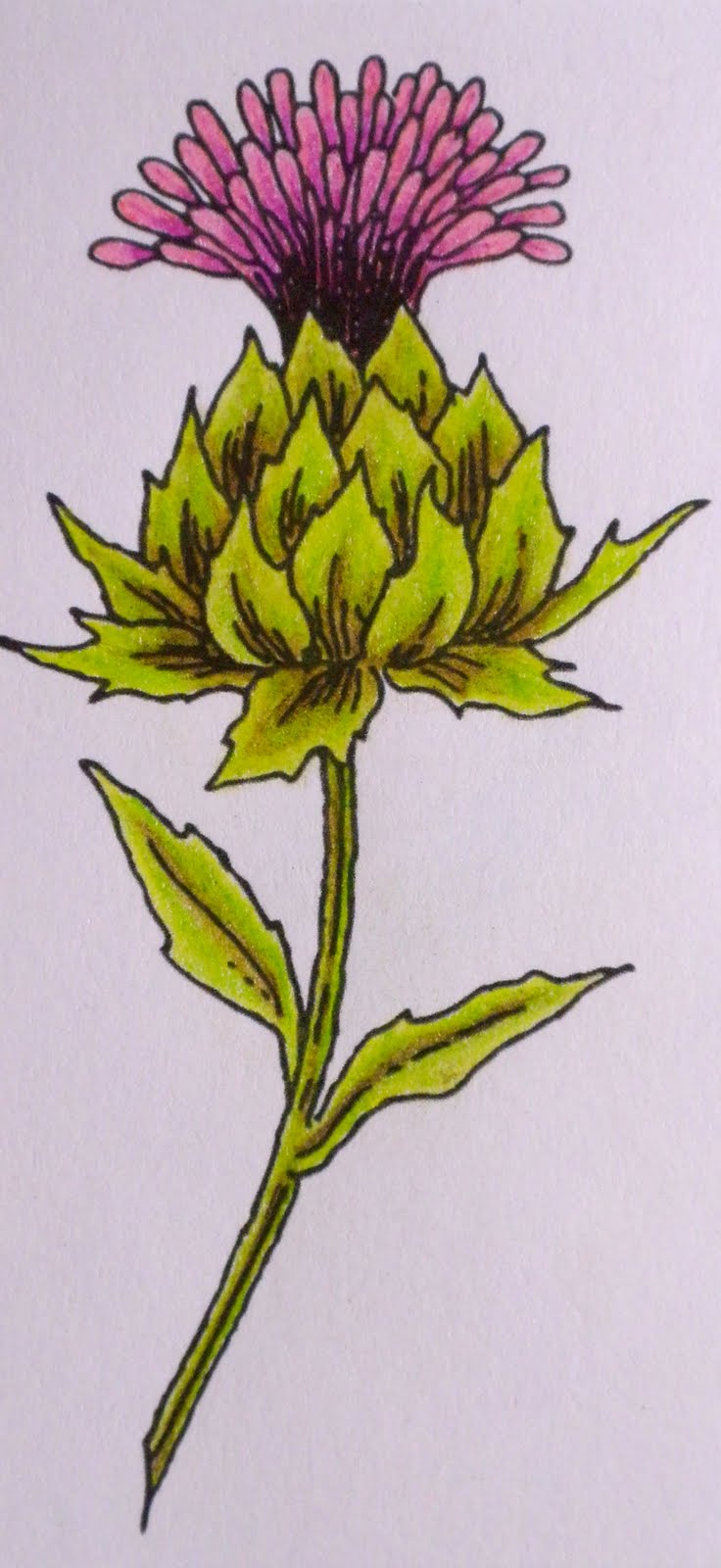
Week 4 centred around applying Colour Theory whilst introducing some interesting techniques; I loved the colouring on white in my previous post & find I am viewing stamps with different eyes in terms of how to colour them. I have used complementary colours for the thistle & mermaid images & a combination of analogous & complementary colours for the dragon image & the treescape.
Digital Image: Glenda Waterworth
Colouring: Derwent Coloursoft pencils
Stamp: Elusive Images UA5SP0326 Underwater Kingdom
Ink: Memento Tuxedo Black, Colouring: Copic Markers

The dragon is coloured using a combination of Derwent Coloursoft pencils, a burnishing pencil & Cotman pan watercolours on Cotman Cold Pressed/NOT Grain Fin 190 gsm watercolour paper. The various ways of using watercolouring media (inks, pencils, Aquatone sticks & pan watercolours) in combination with wax/oil based pencils has been an eye-opener for me & one I particularly enjoy. I have yet to explore using 300 gsm Hot Pressed watercolour paper but intend to do that when I re-take the course if not before.
Stamp: Chocolate Baroque UDLSP0182 Here Be Dragons
Ink: VersaFine Onyx Black

When I came to the colouring negative space exercise I found I did not really have any stamps suitable - in fact I realise that I have avoided such images. A whole new world of images is opening up & I now have a few with which to experiment. I was too heavy handed with my initial attempts but was able to solve that by erasing my pencil colouring then lightly reapplying the colour. It was during this process (combined with doing some technical pencil research regarding the various manufacturers via Peter Weatherill's Coloured Pencil Topics website) that I discovered that it is the wax content in the Coloursoft pencils that accounts for both the "bloom" when several layers are applied & the exceptionally friable lead. I shall be experimenting with the Faber Castell Polychromos oil-based pencils in due course.
Stamp: Chocolate Baroque UA4SP0290 Patchwork Butterfly
Inks: Chipped Sapphire, Stormy Sky & Weathered Wood Distress Inks

I'll finish with what arrived for me last Wednesday - it was our tenth Wedding Anniversary & Richard arranged for this to be delivered.

Thursday, 2 June 2011
MCC Colouring 101 Wk 4 - Colouring White Ink
I love this technique & learnt a lot in the process of working through this exercise in my fourth week of the MCC Colouring 101 Course. There really is no substitute for first-hand experience which - as I discovered - can prove quite surprising.


Glenda had mentioned that there needs to be some "tooth" in the cardstock that is used, but it wasn't until
I tried to stamp my image & colour that I discovered quite how vitally important this is. My initial attempts were using black cardstock which was too smooth so my white ink pooled in places & when I managed to stamp an imprint I was happy with the Coloursoft pencil began to bind on itself as I started to colour. I have found this before when colouring on parchment/vellum but had assumed that it was due to the wax binding agent in Coloursoft (as opposed to the oil binding agent in Polychromos which are the pencils usually recommended for Parchment Craft), not the smoothness of the surface.
It was also interesting to experiment with colours & see how I could blend from one colour (as in the blue anchor where I moved from a greyish blue through purples to blues & dark grey). So to summarize my discoveries:
- use dark cardstock with sufficient "tooth" for the ink not to slide but not so much that it leaves gaps when stamping the image
- use a sharp pencil (a battery pencil sharpener is invaluable for sharpening soft pencils)
- experiment with various colour combinations


Stamps: Elusive Images UA5SP0259 Underwater (seaweed), Elusive Images UA5SP0261 Seashell Collage (anchor)
Ink: Brilliance Moonlight White
Colouring: Derwent Coloursoft Pencils
Subscribe to:
Posts (Atom)