When I'm working through the optional exercises I often find I am surprised by my own reactions. The making of Serendipity Squares & a Grid Layout was a case in point. On the face of it sticking scraps of paper down & stamping over them doesn't seem terribly onerous or exciting, but it was certainly a challenge for me. I think RANDOM was a word that bypassed my vocabulary for there I sat having retrieved all the offcuts of paper from the various packets that they "belonged" to & had to resist the urge to sort them into piles of colours. It was actually quite relaxing just taking the pieces any old how & creatively utilising those scraps proved extremely satisfying. I did apply a little choice in my final grid arrangement - placing a lilac cornered square into each of the grid's corners.
 |
| front view |
 |
| angled view showing sparkle & dimension |
I recently came across Debbie Martin's card (see immediately below) using Pan Pastels & remembered being struck by the way the chequered arrangement of her colours was echoed by not only the actual harlequin stamp pattern but its diagonal placement.
 |
| Debbie's original |
 |
| sketches showing how the eye moves in response to the design elements |
As I don't have any Pan Pastels I had to experiment a little to find a medium which would allow the removal of some of it in order to achieve Debbie's subtle whitening of the flower petals. Distress Inks on watercolour paper were too vibrant but I have several brands of barely used chalks which I purchased during my initial crafting enthusiasm. I tried using those stamping with VersaMark, dabbing with the chalk applicator, erasing (Derwent battery eraser) & fixing with cheap hairspray. This led to my discovering that there are chalks & CHALKS; the cheaper ones were gritty & didn't cover as well as the more expensive creamy Pebbles Inc. which I ended up using as I loved the results. I also improvised with my sentiment & die-cuts as I had neither of those that Debbie used. Additionally I varied my version by changing the flower & layering it differently plus I swapped the colours about.
I'd like to thank Debbie for allowing me to use her artwork for my exercise.
 |
| front view |
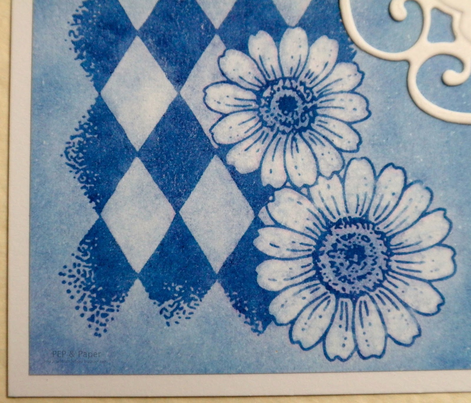 |
| close-up showing detail of petals from which colour was lifted |
 |
| close-up of layered flower showing dimension & colour lifting on petals |
Recipe
Stamps Chocolate Baroque UA4SP0146 Big Flowers (layered flower), UA4SP0237 Butterfly Daisy Collage (daisy harlequin & corner swirl) & UA5GW0360 Words of Comfort & Cheer (sentiment).
Colouring Pebbles Inc. Chalks (Basic Brights).
Inks VersaMark watermark stamp pad, Memories Dye Black (sentiment).
Die Marianne Designs Creatables LR0116 Frames & Swirls.
The white cardstock & green pearl were from stash.
12 comments:
Hello Paula
I really like your analytical approach to each piece of artwork you create, it always seems to give your piece such meaning and purpose.
I am a great fan of diamond stamps and use an old Hero one repeatedly, sadly discontinued and I am in search of a new one and you seem to have solved that one for me, so thank you.
The green and blue/purple work perfectly for me and the dimension of the flower adds super texture and as you say focuses the eye.
Will let you know how the Pan Pastel go, I am really looking forward to having a play with them.
B x
Thanks for sharing your work on these design exercises - very enlightening. I agree with your comment about chalks which can be very variable but I understand the Pan pastels are pure pigment which is why they are so vibrant. I've not succumbed - yet but they are very tempting I must say.
Paula so much colorful goodness to take in!! Your first project is a "quilt" of color and design. I can see your thought to having the squares in certain positions to make the overall design sign with harmony.
The second project is filled with dreamy color!
Hi Paula, again some very interesting pieces of creation! I really love the serendipity technique, it's very versatile and the outcome is always great and surprising! The inspiration of Debbie's card has given you a boost in the creative process, great to see and I can imagine that you have pleasure with using the chalks. I like your approach of the 'focus' point of that card, analyzing is not my strongest talent but I enjoy reading your explanation!
warm greet, Miranda
You are so organised Paula - am sure I would barely keep up with the lessons let alone the homework! Love the quilt effect of the squares, and the colours may be random, but they work. Don't remember seeing Debbie's card before, but really like your version of it - will have to try that reversed image as well now.....
oh Pep where do i start these cards are so very beautiful i love the stamps you have used huni they are so beautiful and I love how you used chalks to get this beautiful soft result too its really beautiful and i love the sentiment its beautifull too the colours you have chosen work so well together,I really must when I can get back into work invest in some of these stamps you use they are so beautiful,your top card is also so very pretty i love your embossing and different techniques you have used,I hope your ok
take care sweetie xx
Oh Paula, your squares are terrific,you are a very talented individual.
Ooh Paula I love how you describe everything you do. It really gets me thinking. I love your second project, in fact I think I prefer it to the original, your flower really stands out more and the sentiment is fab. Debs xx
Oh wow, Paula! Your first card is awesomely gorgeous! I love all the colours brought together with the gold embossing. On your second card you recreated the tones beautifully! I have seen several demos of pan pastels now and I think I will have to have some!
Hi Paula I love your first card the way you have made the quilt with scraps of paper is delightful and the way you have brought them together with the gold works really well
The second card with the chalks works really well the colours are lovely and that flower is gorgeous
Jackie x
from the luxurious gold to the shimmery blue/greens - fabulous work Paula! hugs, annie x
Wow!! your top project totally looks like wall-art to me! :) Brilliant.
Your sentiment card is so pretty - I too love the contrast of the flowers against the harlequin background. Great colours, and so fresh! :)
hugs
xxalisonxx
Post a Comment