PEP tangles - my Zentangle Inspired Art blog
Showing posts with label Chocolate Baroque. Show all posts

Thursday, 24 April 2014

Principles of Design & CAS

I have been thinking about "design principles" for some time but somehow there has always been a block to my understanding how to apply them in card making, so much so that over the last couple of years making a card has become a source of frustration for me - a card taking me a week or so to construct & much of it ending in the recycling. I've kept going, knowing deep down it was something to do with understanding design that was the block, for I could not let go of my NEED to create, but I'd approach making a card for someone with a sense of dread. A couple of years ago I took a design course specifically for card makers but somehow I wasn't ready to understand although I believe it laid a foundation so that concepts such as the Rule of Thirds weren't completely new to me. Learning is very much a cumulative process & we cannot predict how or from where the brain will absorb information. Sometimes it needs to be given the same information but presented in a slightly different format for understanding to be gained.

"Clean And Simple" or CAS has been totally outside my comfort zone, mainly I think, because I didn't understand what it entailed & I couldn't see what lay behind all that uncluttered space. However, when I saw that My Creative Classroom (MCC) was offering a Clean and Simple Card Workshop with the focus being on how to apply design principles it seemed an opportunity, not only to further my understanding of design, but also of CAS. I was explaining CAS to my husband when he remarked how sensible it would be to see design principles utilised in a clear uncluttered format & how that might facilitate learning.

The following are what I created for the 'homework' challenges set during the course.

Focal Point
Stamps: Chocolate Baroque Big Flowers & Celebration Words
Inks: Distress Inks, & Markers (Walnut Stain & Barn Door)
Die: Spellbinders Shapeabilities Framed Tags 3  Other: Lace & Gem

Single Line
Stamps: Penny Black Paisley Outline & Words Express
Inks: Emboss Tinted Stamp Pad with Steward Gill Ultrafine Clear Embossing Powder; VersaFine Majestic Blue
Die: Spellbinders Shapeabilities Framed Tags 3  Other: Floral Ribbon

Weight
Stamp: Penny Black Words Express  Inks: Distress Inks (Walnut Stain & Dried Marigold)
  Dies: Spellbinders Nestabilites  Standard Circles Small &  Splendid Circles
Other: Joanna Sheen Paper, Sizzix Embossing Folder, Woodware Butterfly Punch & Stickles Glitter Glue

Colour/Contrast
Stamps: Penny Black Air Mail  Inks: VersaFine Onyx Black
Die: Sizzix Tim Holtz Alterations Tiny Tabs & Tags
Other: Winsor & Newton Pan Watercolours, Salt, Derwent Coloursoft Pencils & Ribbon
Inspiration: Diana Nguyen - Yours Truly

Asymmetry
Ink: Pine Needles Distress Ink
Dies: Sizzix Tim Holtz Alterations Tattered Florals, Spellbinders Nestabilities Splendid Circles
Other: Woodware Flower Punch, Stickles Glitter glue, Ribbon & Gem
Inspiration: Jane - Purplejet Loves Crafts
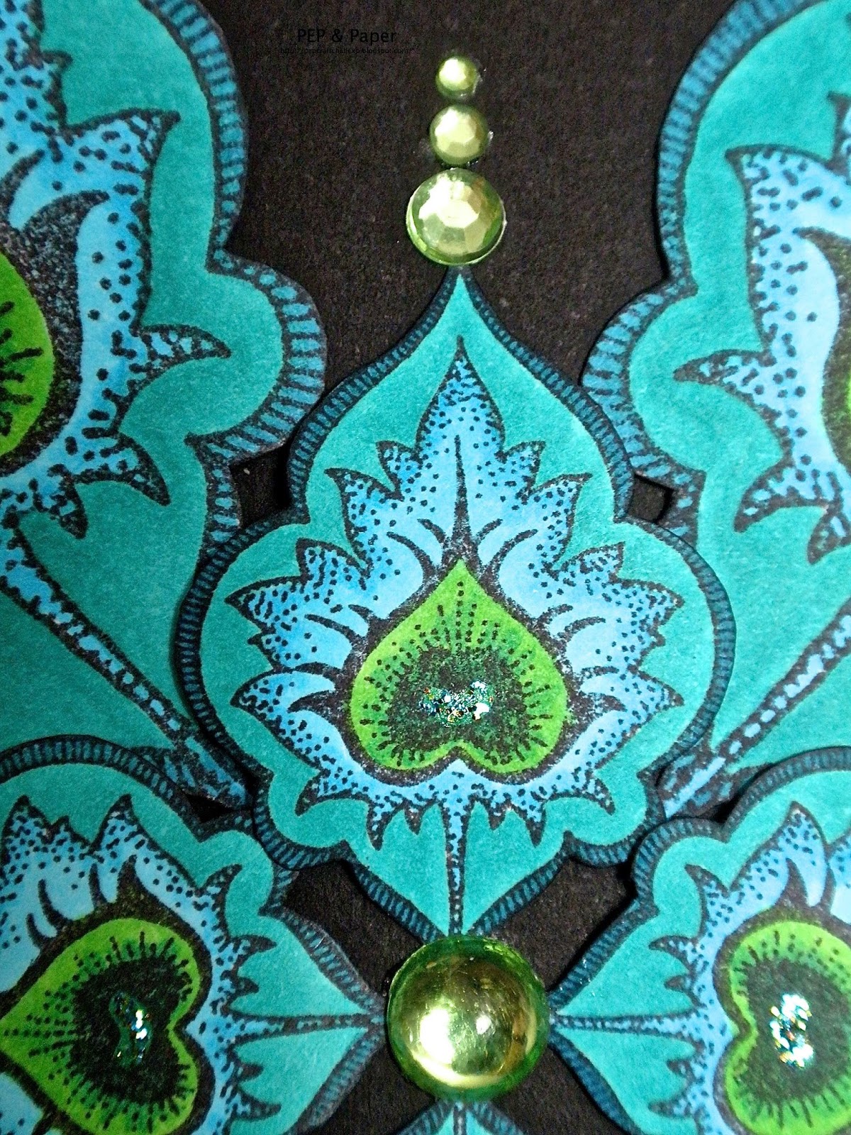
Texture
Stamp: Chocolate Baroque Clear Fancy Flourishes
Inks: Emboss Tinted Stamp Pad with Stewart Gill Ultrafine Embossing Powder
Die: Spellbinders Shapeabilities Ironwork Motifs
Other: Woodware Butterflies, Inverse Corner & Corner Rounder Punches; Gems

I thought I would write of my own difficulties with design in case it might help someone else. I'm not saying that I have arrived at a magic formula for making a card: I still need to consolidate the principles I've been learning through working with them practically. However, I now feel that I am able to move forwards & approach making a card without it being the burden it had become for I have something concrete with which to work instead of reinventing the wheel every time.  I'm really surprised by how I can appreciate CAS cards now & I know that the principles that underpin their success are also at work in product/technique based cards which catch my attention.

Sunday, 1 December 2013

Purple Poppies

Thank you for all your kind wishes & understanding - they are much appreciated. I am much improved & now have good movement with both the arms.

I've been wanting to experiment further with watercolouring using inks  & especially what effects can be achieved using just the one inkpad - in this case Nick Bantock's Damson Plum. Nick Bantock's inkpads are dye based & behave similarly to Distress Inks in that they react with water giving further interesting nuances of colour. Like Distress Inks the effects achieved  also vary in accordance with the type of paper they are applied to. The paper I used here - Winsor & Newton Cotman 190gsm Cold Pressed/NOT Grain Fin Watercolour Paper - is one I come back to time & again with these inks for being 190gsm it allows me to fussy cut without wrecking my scissors.

front of card
close-up of water coloured poppy image
contrasting with patterned paper
Close-up showing gem & sequin
butterflies embellishing plus tone-on-tone
stamping with patterned paper background 
close-up showing brad with leaf sequins
& ribbon embellishing over
 tone-on-tone stamped background
inside of card showing stamped images
& pearlescent matting layer
NB
The photographs show some of the white or cream areas as tinged with green - especially apparent in my second photograph above: there seems to be some kind of reaction when photographing whites/creams & purples together.  I tried various photo editing options to no avail & this is the best I could get it.


The poppies were repeatedly stamped in Nick Bantock Damson Plum & then watercoloured using ink from the same inkpad. Once dry a strip of the images was cut off so as to leave some parts of the flowers & leaves extending outside the cut edge to be fussy cut individually (see above close-up photo of watercoloured poppy).

Supplies
Stamps Chocolate Baroque UDLSP0320 Fresh Florals (poppies on front), UA6SP0272 Abstract Flowers (tone on tone background) & UA4SP0151 Flora & Fauna (inside card).
Inks Nick Bantock Damson Plum (poppies on front & inside, edging purple panel inside card); Dusty Concord Distress Ink (edging patterned paper); Emboss Tinted Stamp Pad (tone on tone background).
Cardstock White plus assorted purples in various finishes from stash.
Paper Winsor & Newton Cotman 190gsm Cold Pressed/NOT Grain Fin Watercolour Paper; Graphicus Guild Membership Pack (patterned paper).
The gems are Anita's whereas the sequins, brad & ribbon are from stash.

I also have a Zentangle post today HERE.

Monday, 15 July 2013

The Same But Different

I've been struggling to make a card for several days but nothing has been coming together. There are good reasons for this: we are about to have our house valued prior to selling plus my husband had knee surgery in the middle of May which has meant that I've been wearing a lawn maintenance plus woodland management hat as well as being head gardener. Seeing my frustration my husband suggested I make one I'd made previously - I adapted that idea by making a variation of my design HERE using Chocolate Baroque instead of Penny Black stamps. 

front of card
close-up showing sentiment panel & tone on tone
background stamping
close-up showing shine of wet embossing,  iridescent
glittering, pearlescent & matt white contrasts
 plus shaped dimension of butterfly 
inside of card
close-up of corner stamping

When I was working with the butterfly I had a vague idea that I'd read somewhere about painting with Liquid Pearls & thought I'd try it (I just diluted a drop with a little water & applied it to the butterfly's wings using a paintbrush). I was quite thrilled with the results & decided to leave the very edges of the butterfly wings plain white so as to provide a touch of contrast without introducing any specific colour to detract from the iridescent shimmer of the Stickles used for the body & wing spots. 

Recipe
Stamps  Chocolate Baroque UDLSP0153 Just Butterflies (butterfly), UDLSP0155 Delightful Damask (sentiment) & UA4SP0146 Big Flowers (background & inside of card).
Inks Fired Brick Distress Ink (background), VersaFine Onyx Black (sentiment), VersaFine Onyx Black with Stewart Gill Ultrafine Embossing Powder (butterfly), VersaFine Satin Red (inside of card).  
Pencils/Markers etc… Memento Tuxedo Black Dual Marker (edging cardstock), Crystal Ice Stickles Glitter Glue, White Opal Liquid Pearls (colouring butterfly wings). 
Cardstock Whites & assorted blacks in various finishes from stash.
Paper Textured red from stash.
Dies Spellbinders Nestabilties Labels 16 (sentiment), Sizzix Bigz Die – Elegant Flourishes (swirls).
The pearls are Papermania.

Thursday, 27 June 2013

Peacock Mandala

I had actually intended to use several more elements from Glenda's recent release of peacock stamps but eventually the mandala looked right using only two of the stamps - repeating the same image but in different sizes. This is a feature that I really appreciate with Chocolate Baroque: the provision of the same image but varying the direction it faces &/or the sizing.

front of card
angled view to show glittering
& central patterning
close-up showing detail of colouring plus
embellishing
angled view to show dimensional shaping & layering
inside of card

The two stylised feathers were repeatedly stamped & cut out after colouring & then gently shaped prior to assembling them in a mandala pattern. 

Recipe
Stamps Chocolate Baroque UA4SP0419 Peacock Parade.
Inks Memento Tuxedo Black (images on card front), Memories Black Dye (inside of card & edging paper).
Pencils/Markers etc… Copic Markers, Memento Tuxedo Black Dual Marker; Stickles Glitter Glue (Patina).
Cardstock Blacks in various finishes from stash.
Paper Textured light blue from stash.
Punches Woodware (Corner Rounder & Inverted Corner).
The gems are an assortment from stash including Kanban & Anita's.

Challenge Entered
Simon Says...Anything Goes

Thursday, 24 January 2013

Friendly or Loving Roses

I wanted to work with the latest release of rubber stamps from Chocolate Baroque (UA5SP0402 Rose & Thistle) which is also the current Stamp of the Month set at the same time as building myself a repertoire of background techniques which I can turn to. Initially I thought of making ATC sized panels but upon rummaging in my W H Smith white card box (I only take a new sheet of A4 card/paper if I don't have a large enough piece in one of my scraps boxes which are sorted according to type/colouring medium: watercolour, alcohol markers, W H Smith 220gsm white & Southfields 160gsm Bright White) I found a whole pile of 3½ inch Zentangle tiles I'd cut & these are proving a perfect format.

front of card
close-up of image panel
angled view of image panel showing
dimension & shine of wet embossing 
close-up showing detail of corner embellishing, patterned
paper panel plus layered background stamping 
inside of card
close-up showing inked edges of both patterned paper
frame (Tattered Rose) & message panel (Spun Sugar)

The image was stamped in VersaFine Onyx Black & then wet embossed with clear embossing powder prior to colouring with Copic Markers. This is a technique which I learnt from Elizabeth Allan which gives a lovely finish, particularly with a stamp like this where there are large solid areas, & avoids the 'contamination' of the marker tip which can occur when using black/coloured embossing powder.


The background was made by stamping each of the three rose images randomly around the edges working inwards: using the large bud with Dried Marigold first, then the flower-head only from the single stem with Tattered Rose, & lastly the smallest bud with Spun Sugar. Finally Spun Sugar Distress Ink was applied around the edges using a blending tool.


Recipe
Stamps Chocolate Baroque UA5SP0402 Rose & Thistle.
Inks VersaFine Onyx Black with Stewart Gill Ultrafine Embossing Powder (main image); Dried Marigold, Spun Sugar & Tattered Rose Distress Inks (background & internal panel inking as detailed above & in photos).
Pencils/Markers Copic Markers.
Cardstock White & assorted blacks in various finishes.
Paper Joanna Sheen.
Dies Spellbinders Shapeabilities Lace Doily Motifs.
Punch Woodware (scalloped square).

Challenges Entered
Stamping Sensations January Challenge - Friendship (my card is intended for a friend's birthday but it could equally be used for a 'Just to Say/Friendship' card)
Penny Black & More January Challenge - Love is in the Air (with the rose imagery & the pink colouring this would be appropriate for a Valentine or Anniversary card)

Sunday, 20 January 2013

January Quintiles

Firstly, thank you to everyone who left me get well wishes - I'm finally getting back on my feet again.

The Chocolate Baroque Online Community now has quite a number of groups, each dedicated to different aspects of crafting (from ATCs to Zentangle) using Chocolate Baroque products or items available through the Chocolate Baroque online shop. Some of the groups are swap groups, others focus upon encouraging one another with ideas through uploading photos of completed projects. This year we have a Christmas Group in the latter category: a theme is set  each month spurring us on to making one or more Christmas cards per month in order to avoid the mad scramble in December.

We have a new format of "Quintiles" for a monthly swap where we submit two 5 inch square pieces of artwork created along a given theme. The two Quintiles can be exactly the same, varied slightly (different colours, embellishments etc........) or completely different. I thought I'd like to explore how different colour combination can alter the appearance of the same basic design each month, so that's what I'm starting out with. The January theme is Winter Wonderland.

 
fronts & backs


close-ups of wet embossed vellum pattern fragments 
embellished with brads & gems


 close-ups showing dimensional shaping & 
interwoven layering of flowers


 close-ups showing corner details & sequin embellishments

The flowers were stamped 6 times for each tile, coloured using Copic Markers & cut out. The petals were shaped around a pencil prior to layering the flowers in pairs whilst interleaving & offsetting the petals. Each flower centre was made from a punched floral shape topped with a piece of card candi.

Recipe
Stamps Chocolate Baroque UA4SPO398 Pears & Baubles (pattern fragment) & UA4SP0362 Steampunk Christmas (flowers).
Inks Memento Tuxedo Black (flowers), Emboss Tinted Stamp Pad with Stewart Gill Metallic Silver/Metallic Gold Embossing Powders (pattern fragment), Black Soot Distress Ink (inking some cardstock edges).
Pencils/Markers etc... Copic Markers, Memento Tuxedo Black Dual Marker.
Cardstock Black & white plus assorted silvers/golds in various finishes from stash.
Paper White parchment from stash.
Die Cuttlebug Vintage Corners
Punches Woodware (scalloped square, flower)
The card candi is Craftwork Cards; the brads & sequin stars are from stash.

Thursday, 3 January 2013

Tidying The Creative Process

Whilst making the Alphatags I acquired a heap of odd images & die-cuts that weren't quite right for what I was working on. I never have a completed project in my mind - I start & then proceed by trial & error with the design evolving as I go. The image & the die-cuts for this card were in that discarded pile. Incidentally, the die-cuts had also been doctored slightly with elements trimmed off them so the die-cut under the image is missing a corner & the vertical has had both of its endmost parts removed.

This card actually developed over roughly three days of experimenting with different ideas of placement & additional components such as background & embellishing. Daily life & the incidentals of correspondence, commenting & tidying/rearranging etc...... carried on in the meantime. This is fairly typical of my creative process which means that I'm not particularly fast or prolific in production/execution.

front of card
angled view showing sparkle & pearlescence
of gems & matted layers
close-up showing watercolouring & inked edges
 of image panel plus tone on tone background stamping
inside of card showing textured red paper
plus silver inked edges of message panel

Recipe
Stamps Chocolate Baroque UDLSP0056 Butterfly Whimsy (retired).
Inks Black Soot Distress Ink (stamping & watercolouring plus edging image panel), ColorBox Chalk Warm Red (background tone on tone stamping & inking cardstock), Encore Ultimate Metallic Silver (inking message panel edges).
Cardstock Winsor & Newton Cotman 190gsm Cold Pressed/NOT Grain Fin Watercolour Paper; red, white, white, Moondust black & textured silver all from stash.
Paper Textured red from stash.
Dies Spellbinders Shapeabilities Ironwork Motifs & Nestabilities Large Deckled Rectangles.
The gems are from stash.

Tuesday, 25 December 2012

Christmas

Wishing Everyone a Happy & Peaceful Christmas & New Year

front of card
angled close-up showing sparkly 'grounding' plus
 dimension of reindeer 
angled close-up showing sparkly 'grounding'
plus dimension & shine of tree
close-up showing pearlescence & sparkle of
 snowflakes against textured matt white cardstock
inside of card

The background was made following Heather Telford's sponging tutorial except that I used ColorBox pigment inkpads instead of Memento dye inkpads. The silver star is a sequin & the snowflakes were punched out of pearlescent paper some years ago using a punch that has since found its way to the metal & plastic recycling centre. The crystal gems decorating the snowflakes were from stash.

The reindeer & the tree are from the retired 'Traditional Christmas' sheet of Chocolate Baroque stamps. The reindeer was stamped in VersaFine Vintage Sepia, coloured with Faber-Castell Polychromos pencils blended using a dry paper stump & then cut out & shaped prior to mounting. The tree was stamped in VersaFine Olympia Green, wet embossed with clear embossing powder, then also cut out & shaped prior to mounting. Silver Ice Stickles Glitter Glue was used to 'ground' both the images & create a semblance of icy snow.

Since the card was made for a gentleman the inside was plainly decorated using navy & textured matt white cardstock with decorated corners (Xcut star punch & Woodware corner rounder).

Challenges Entered

Saturday, 15 December 2012

Zigzag Ziggurat & Zentangle Alphatag

My "Z" tag for the Baroque Guild Alphatag swap is based around a Ziggurat (an Assyrian/Babylonian temple tower or staged tower in which each storey is smaller than that below it) of parcels with a zigzag pattern for the background. The inspiration for the pile of parcels came from The Gift of Christmas stamp sheet which I originally used but wasn't happy with as I wanted something more tactile. I was going to put a large "Z" at the top of the pile but it didn't look right at all - my husband suggested a star & that reminded me of the Christmas Auraknot Star that I've been drawing (see PEP tangles), hence I acquired another "Z" in the form of Zentangle. It is actually quite apt in terms of the Ziggurat for it is quite likely that the Zoroastrian priests or Magi who followed the star to Bethlehem for Jesus's birth spotted that star on one of their nightly scans of the sky from the top of one of their Ziggurat towers. (See here for Zoroastrianism and my fellow Alphatagger, Vronnie at Vroncards, who used the wise men for her "Z" tag).

front of tag
close-up of upper section showing Zentangle star
& overstamping of patterned paper on parcels
close-up of lower section showing the patterned
paper parcels tied with different metallic threads
close-up showing dimension of wet embossed
"Z" plus zigzag background
close-up showing dimension  & layering
of Zentangle star plus zigzag background
back of tag 
close-up showing paper pierced scallops & inked edges
of theme panel plus textured pearlescent ivory cardstock

The parcels were made by wrapping oddments of the patterned paper around different sizes of thick cardstock & then tying assorted colours of metallic thread round them. The paper for the top two parcels wasn't particularly patterned so these were overstamped before wrapping. The creasing of the patterned paper when folding such small pieces occasioned some 'white cracking' which was "removed' by running the tip of a Coloursoft pencil in an appropriate colour along the sides of the parcels.

For the star shape I drew around a large star gem & enlarged it to the size I wanted & then tangled with a brown fineliner using the Auraknot pattern skipping two points (see here for a detailed explanation). A brown Coloursoft pencil with a paper stump was used for the shading. Two of the stars were offset & layered in order to achieve the ten-pointed dimensional star as above.

Recipe
Stamps Elusive Images UA4HC0177  ATC Art Plate (zigzag pattern); Chocolate Baroque UA4 SP0150 Texture Blocks (overstamping patterned paper) & UA6GW0211 Celebrations Alphabet ("Z" letters).
Inks Chestnut ColorBox Pigment "Cat's Eye" (tone on tone backgroud stamping, Memento Tangelo (overstamping patterned paper), Brushed Corduroy Distress Ink (inking various cardstock edges), Emboss Tinted Stamp Pad with Stewart Gill Metallic Copper Embossing Powder ("Z" letters).
Pencils/Markers etc... Staedtler Triplus Fineliner & Derwent Coloursoft pencils with paper stump, Signo uni-ball copper gel pen.
Cardstock Brown, cream & textured pearlescent ivory from stash.
Paper Graphicus Guild Membership Pack.
Die Sizzix Movers & Shapers L Die - Tag & Bookplates.
Punches EK Success (small circle), Woodware (scalloped squares).
The gems & ribbon are from stash.