PEP tangles - my Zentangle Inspired Art blog

Thursday, 18 August 2011

MCC Colouring 101 Wk 2 - Rounded Application

Links: Previous Post, Glenda Waterworth, My Creative Classroom (MCC)

 from my sketchbook

Glenda uploaded a YouTube video on how to colour the Morning Glory digital image she provided for the MCC Colouring 101 students to practise with. The video itself makes fascinating watching, moreover Glenda's company Chocolate Baroque also sells an A4 Unmounted stamp sheet - UA4SP0151 Flora & Fauna -  including a very similar image.


I was inspired by the fact that the Morning Glory flowers in other colours apart from blue & decided to incorporate the violet aspects into my colouring. The above is not quite what I had in mind but I'm content that the flower looks realistic - even if these precise colour markings don't actually exist in reality.  Colouring seems to have a life all of its own with serendipity being very much part of my own creative process & allowing me a freedom that I'm loath to stifle.


I wanted to apply the rounded shading principles to a different image & so tried this rose. With hindsight I should probably have left the highlights white & not tried to give my rose red & yellow petals. It almost ended in the bin but I decided that it was worth keeping to act as a reminder not to over-egg the pudding.

Recipe
Stamps etc... Morning Glory Digital Image provided by & copyright to Glenda Waterworth; Elusive Images (Chocolate Baroque) UA4SP0242 Harlequin Rose. 
Ink Memories Black.
Colouring Faber-Castell Polychromos Pencils.
Cardstock Southfield 200 MIC Bright White Card 160gsm.

Thursday, 11 August 2011

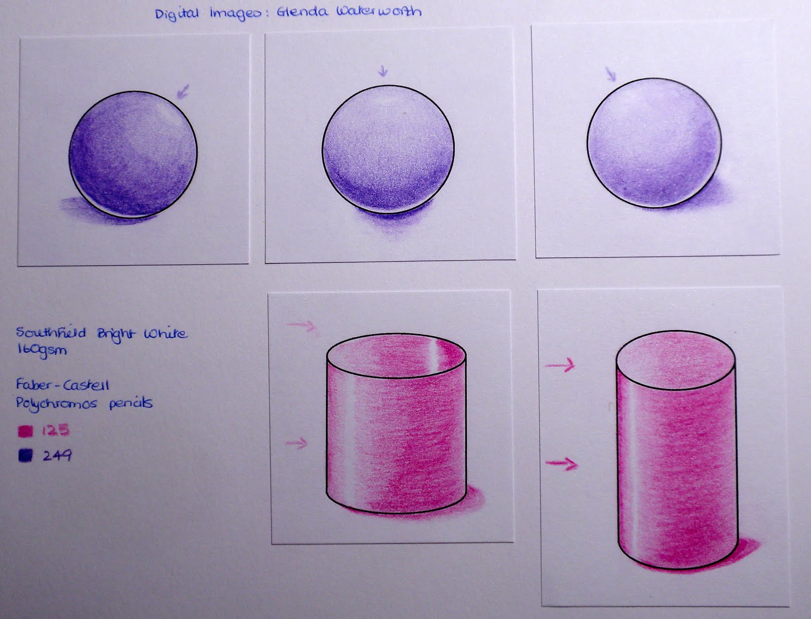
MCC Colouring 101 Wk 2 - Rounded Shading & Shape, Pencils & Paper


 from my sketchbook

Prior to my first Colouring 101 classes this May I cannot remember ever having tried exercises such as shading spheres & cylinders, doughnuts & spirals. When attempting to colour a snail last summer I struggled to understand quite how to make the shell look real. Since then I have shied away from using that stamp - though snails are amongst my favourite images. After hours of colouring in May I made a start on the spheres & cylinders looking real but the doughnut & spiral defeated me as I could not grasp the shading relationships. I'm hugely encouraged this time round for I see progress since then & have tangible evidence of practice being the key to improvement.


hollow (left) & solid (right) cylinders 

doughnut & spiral (ammonite)

Rather than copying Glenda's examples exactly I wanted to try applying the same principles of colour theory & shading/shape by using different colours &/or images. Although this entails a certain amount of  bin filling it is extremely thrilling to make discoveries & the only way I can lose is not to dare to try.

I'm unsure about the highlight but it was magical being able to 
 achieve the gradations of colour simply by layering pencil colours

My first encounters with pencils last year gave rise to many questions & through the class I've discovered  that others also struggle when it comes to choosing brands & papers. I thought it worth adapting some of Glenda's homework exercises in order to explore my own resources & to keep a record of my thoughts & conclusions. At the end of the day it will be a matter of personal preference & access to materials that will determine choice.

Cardstock for Polychromos
Using the same colours of Polychromos pencils I stamped & coloured the fish onto 3 different cardstocks: Southfield 200 MIC Bright White 160gsm; W H Smith White Card 220gsm; Winsor & Newton Lana Cartridge Paper 130gsm.

There is very little discernible difference in appearance but the real variations became apparent when applying colour to the surfaces. I was initially trying to improve upon the Southfield (smooth & bright white) with regard to the ease of laying down & blending layers of colour but found the other two surfaces even more difficult to use. I thought that the W H Smith would be an improvement as, although it is greyer in colour, it has more tooth. I found this surface too springy with the pencil almost making indentations in the surface unless I was extremely light-handed. Creamy in appearance & with a little tooth the Cartridge Paper seemed somewhat resistant to the application of colour & it was hard work laying down a smooth blend

Left: 25 layers of colour, Right: 7 layers of colour using Sansodor to blend along right edge

Discarding the Cartridge Paper I decided to try the heavier Craftwork Cards Digital Ultra Smooth Premium 250gsm Cardstock really giving each strip of card a hammering with 25 layers of Polychromos colour & then brushing my finger over the coloured surface. The Southfield was fine, just starting to catch a little as the layers were piled on. The W H Smith caught more & was a bit patchy as the layers increased, finally it smudged under my finger. The surface of the Craftwork Cards cardstock although smooth began to disintegrate before I had finished applying the 25 layers. 

The more usual application of 7 layers was tolerated by all 3 cardstocks with the Craftwork Cards being the smoothest but blending patchily with Sansodor & allowing migration of colour along the edge. The Southfield wasn't as smooth when layering but gave by far the smoothest blend with Sansodor & did not allow any migration at the edge. The W H Smith was also somewhat patchy in blending both by layering & with Sansodor, plus it allowed colour migration along the edge.

Wax-Based or Oil-Based
When Glenda demonstrated how to use a Blender Pencil during the first course I wondered if it mattered that I was using the oil-based Lyra Splender with the wax-based Derwent Coloursoft pencils. Since I had some Lyra Pencils I tested it out & found that it didn't. I have just discovered a technical book (The Ultimate Guide to Colored Pencil  by Gary Greene) which confirms my findings. 


Having discovered that the wax content of the Coloursoft pencils accounts for the debris & smudging when colouring I decided to compare my tin of 36 wax-based Derwent Coloursoft Pencils with my tin of 36 oil-based Faber-Castell Polychromos Pencils (I came across these tins in a Sale when I first started crafting & impulsively bought them!!!!). I find the selection of 36 colours doesn't intimidate me but provides an adequate variety with which to work. For the above blending of colours I selected similar colours from each set & used the Derwent wax-based Blender for the Coloursoft & the Lyra oil-based Splender for the Polychromos.

Derwent Coloursoft
  • English wax-based available in 72 colours
  • give off debris when colouring & thus require frequent sharpening for finely detailed work
  • debris allows smudging & less defined edges
  • other wax-based brands - US Prismacolor Premier, Swiss Caran d'Ache Luminance 6901 

Faber-Castell Polychromos
  • German oil-based available in 120 colours
  • very little debris (if any) retaining a sharp point for finely detailed work
  • allows clearly defined edges with minimal smudging
  • other oil-based brands - German Lyra Rembrandt Polycolor, Swiss Caran d'Ache Pablo


Recipe
Images Fish - Elusive Images (now Chocolate Baroque) UDLSP0330 Something Fishy; Circles & Cylinders - digitally provided by & copyright Glenda Waterworth.
Ink Memories Black.
Colouring Unless otherwise specified - Faber-Castell Polychromos Pencils.
Cardstock Unless otherwise specified - Southfield 200 MIC Bright White Card 160gsm.

I would very much value any comments/suggestions regarding other brands of pencils & cardstock/paper.

Tuesday, 2 August 2011

Tools for the Job in Hand

In December 2006 we moved into a 1970s bungalow which was badly in need of updating. We have finally arrived at the lounge & the fireplace & with the builder having a slot starting this week work has begun. It is proving quite educational & I can see parallels with crafting techniques so thought I'd share some thoughts here.


Clearing some space
Around a thousand of my husband's books are shelved either side of our fireplace. These had to be removed as well as the shelving.

I like to start off with a space roughly 3ft x 15ins on my work counter where I have a glass mat & my Sor-Pal next to one another.


The right tools for the job in hand
This is what the builders used to cut through the concrete aggregate (breeze-blocks) of our walls. It creates a noise which is incredible & creates phenomenal clouds of dust. Our workmen looked like they had had bags of flour thrown at them. An ordinary power drill is just not tough enough for the task.

Similarly I like to use Tim Holtz's scissors for cutting out rubber & plastic as ordinary scissors really struggle to cut cleanly.


The right materials with which to build/create
This is one of the lintels (reinforced concrete with steel rods down the middle) being placed across the fireplace.

I use Glossy Accents to adhere heavier embellishments with - I know they will not fall off.


Preparation/Groundwork
Two holes were made from the front, then one from either side of the chimney breast & the space between cleared for the first lintel to be inserted. This will initially take the weight of all that is above.


Similarly before I heat emboss I will wipe my cardstock with an anti-static pad to stop stray particles of embossing powder sticking & being embossed in addition to my stamped image.

Clearing Up

above was the appearance at lunch time & below after work finished for today

.........now I have to admit that I do not tidy everything away for the night when I am crafting but I am the only one who uses my space.

Wednesday, 27 July 2011

MCC Colouring 101 Wk 1 - Water Based Markers & Watercolours


from my sketchbook

Stamp: Elusive Images (Chocolate Baroque) UA5SP0327 Seadragon
Inks: Memories Black (image), Tea Dye Distress Ink (inked edges) 
Colouring: Whispers Strokes Pens (left), Cotman Pan Watercolours (right)
Initially I selected a large flower to colour but after several attempts with the Whispers Pens resulted in blotchy flat colouring I realised that once again I'd picked an unsuitable image for the medium/technique - it is one thing to copy the image/image type exactly but selecting one's own is another matter. A flat accumulation of penstrokes ensued when I tried shading the individual crenallations to give depth but I was rather pleased when I tried the above shading: dark to light from the bottom of each foliage tier/layer.

The numbering system of the Whispers Pens is my own as I now find it impossible to colour without having an idea of how the colour appears on cardstock as opposed to the cap. I used the sticky labels available at any stationery supplier, wrote the number by hand & cut to an appropriate size.

Monday, 25 July 2011

MCC Colouring 101 Wk 1 - Migrating Ink, Inkpad Pallettes & Pencils


from my sketchbook


Migrating Ink
Stamp: Elusive Images (Chocolate Baroque) UDLGGSPO23 Nature's Peace
Ink: Frayed Burlap Distress Ink
Since I'm happy with the Cotman Cold Pressed 190gsm watercolour paper I had settled on using that for all my projects but, as I was working on my first images using the migrating properties of water soluble ink, I had an itch to replicate what I was doing on the Langton Hot Pressed 300gsm watercolour paper. What a surprise when I did. I could barely move the ink to create a shadow outside my stamped image (top row) despite adding copious amounts of water & had only slightly better success when moving the ink within the stamped lines (bottom row). Additionally the whole image appeared somewhat bleached (right). I much prefer the vibrancy & ease of manipulation when using the Cotman (left).

 Inkpad Pallettes
Stamp: Elusive Images (Chocolate Baroque) UDLSP0235 Nature's Table
Inks: Forest Moss & Barn Door Distress Inks
This was not as easy as it might look for I discovered that I needed to select the image that I chose bearing in mind the different colours I was going to combine. My first attempts had too many elements but applying Glenda's colour theory teaching in conjunction with a an artist's colour wheel I was rather pleased with this (bottom right) result. The first (top left) is the image simply stamped, then (top right) with ink pulled into the image using a wet paintbrush & thirdly (bottom left) using the same inkpad as a palette.

Adding Pencils
Stamp: Elusive Images (Chocolate Baroque) UDLSP0235 Nature's Table
Ink: Walnut Stain Distress Ink  Colouring: Derwent Coloursoft Pencils

Friday, 22 July 2011

MCC Colouring 101 Wk 1 - Groundwork

Links: Previous Post, Glenda Waterworth, My Creative Classroom (MCC)

I finally managed to buy some Hot Pressed Watercolour paper & recently obtained some Stampin' Up! Whisper White cardstock, Ryman's Coated Card & some cardstock specifically designed for use with alcohol markers. So, these were what I used with my favourite inkpads for the purposes of testing:

  •  the clarity of the stamped impression;
  •  the combined response of ink & paper to water;
  •  the ability to manipulate the ink if/when it migrates.

Nick Bantock Dye Inkpad - Lamp Black
A good detailed stamped impression retained whilst allowing the manipulation of ink with a wet paintbrush.

Tim Holtz Distress Dye Inkpad - Black Soot
A good detailed stamped impression becoming less defined whilst allowing ink manipulation with a wet paintbrush on watercolour paper. It is designed to react with water but refuses to on the Ryman's, Premium & Whisper White.

Memento Dye Inkpad - Tuxedo Black
Very good detailed stamped impression which is retained whilst allowing a little manipulation of ink with a wet paintbrush. Supposedly water resistant it does "ghost" as above.

Memories Dye Inkpad - Black
An amazingly reliable clearly defined & detailed stamped impression which is completely water resistant.

Brilliance Pigment Inkpad - Graphite Black
A softer less clearly defined but detailed stamped impression completely water reistant.

VersaFine Pigment Inkpad - Onyx Black
With a reputation for clear detailed water resistant stamped impressions I find it less defined than the Memories.


Conclusions
The surfaces of the  Ryman's, Premium & Whisper White cardstocks were all affected by contact with water leaving a residual furriness to the touch as opposed to the smooth finish where there had been no contact. It really is a matter of using the appropriate ink & cardstock for the medium with which I wish to colour & the technique I want to use, so these are my current preferences.

  • A Memento inkpad on one of the glass smooth or coated cardstocks (I've yet to decide which of those I prefer) when colouring with alcohol markers. 
  • The Memories inkpad on watercolour paper for any colouring technique where I want a crisp defined stamped imprint with no ink migration upon the application of water. I personally prefer the lighter weight (90lbs/190gsm) Cotman Cold Pressed /NOT*GRAIN FIN watercolour paper to the above Langton as it is easily obtainable (in the UK it can even be obtained at a Hight Street W H Smith  & sometimes at a considerable discount) & has fractionally more tooth allowing easier blending/layering of coloured pencils. The other advantage of using the 190gsm is that it is "scissor friendly" & can be used where detailed (fussy) cutting out of images is required.
  • The Distress or Nick Bantock inkpad on watercolour paper where I wish to utilize the water soluble migration properties of the ink for colouring.

Recipe
Stamp Elusive Images (now Chocolate Baroque) UA5SP0328 Mermaid Queen.
Cardstock Langton - Daler-Rowney The Langton Extra Smooth Hot Pressed Watercolour Paper 140lb 300gsm; Ryman - Ryman Bright White Coated Card 200gsm; Premium - Southfield Premium Pure White Glass Smooth Bleed Resistant 200gsm; Whisper White - Stampin' Up! Whisper White Smooth Cardstock.

Thursday, 21 July 2011

Thank You & MCC Colouring 101

Just a few words to thank you for the comments & emails I have received since my last post. Migraine control is greatly improved & there is gradual daily progress.

I shall be concentrating on the coursework for the MCC (My Creative Classroom) Colouring 101 which Glenda is running again & I intend to build upon the work that I did the first time whilst using different images where possible. So, for the moment, my posts will revolve around that & my continuing discoveries. The latter arise when I least expect them to & understanding grows rather in the manner of peeling off the successive layers of an onion.